contact@cayeit.com

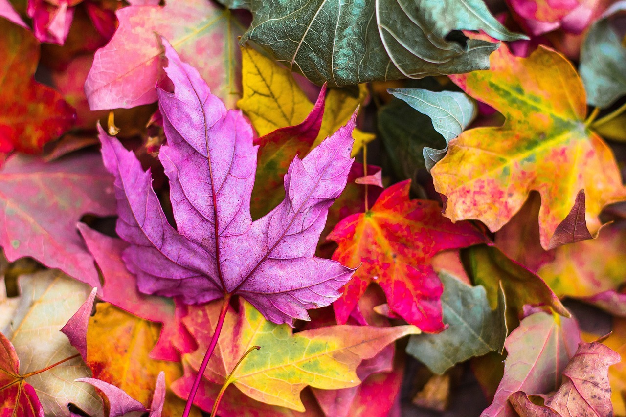
Life is a complex and beautiful mosaic, a blend of energy, elements, and unseen forces that shape our daily experiences. In this vibrant mix, colours emerge as quiet yet powerful influences, shaping our mood, health, and overall sense of balance. They’re like the background music of our lives, subtly but significantly altering our inner and outer worlds.
Consider the ancient wisdom of Ayurveda that links colours to the five fundamental elements (Panchamahabhutas) : Space (Akash), Air (Vayu), Fire (Agni), Water (Jala), and Earth (Prithvi). This connection suggests that the colours we surround ourselves with can ground us, calm us, energize us, clarify our thoughts, or expand our sense of the infinite. It’s fascinating to think that the green of a forest or the blue of an ocean isn’t just beautiful but also has a tangible effect on our inner equilibrium.
Then there’s the concept of the three doshas-Vata, Pitta, and Kapha, which are like the personal health fingerprints in Ayurveda. The idea that the colours we prefer can reflect and affect our physical and mental states is intriguing. Maybe that’s why we’re drawn to fiery reds and oranges when we need a boost or seek out calming blues and greens when we need to relax. And let’s not forget the three gunas-Sattva, Rajas, and Tamas; which represent different mental and emotional states. It’s as if each colour carries its own emotional weight, capable of lifting us into a state of clarity and balance, propelling us into action, or soothing us into restful stillness.
What’s truly wonderful is that this knowledge empowers us. By understanding the subtle language of colours, we can harmonize our environments with our inner needs, creating spaces that nurture our well-being. It invites us to look at the world around us in a new light — to see the reds, blues, yellows, and greens not just as hues, but as tools for healing and harmony.
The Influence of Colour on the Five Basic Elements
The profound impact of colour on the human psyche and physical health is an age-old concept, deeply rooted in various cultures and traditions. This connection extends to the five basic elements: Space (Akash), Air (Vayu), Fire (Agni), Water (Jala), and Earth (Prithvi). Each element resonates with specific colours, influencing our environment and well-being. Understanding this relationship can help us harness the healing power of colours to create balance in our lives.
Earth (Green/Brown)
The Earth element, symbolized by stability, nourishment, and growth, finds its essence in green and brown colours. These colours reflect the natural world – the soil, trees, and plants that provide our sustenance and foundation.
- Green: This colour embodies renewal, balance, and harmony. Surrounding yourself with green can enhance feelings of safety and comfort, promoting emotional well-being. It’s particularly beneficial in spaces where you seek rest and rejuvenation, like bedrooms or living areas, as it mimics the calming effects of nature.
- Brown: Grounded and reliable, brown evokes a sense of strength and support. It’s akin to the earth beneath our feet – solid, steady, and life-sustaining. Incorporating brown into your surroundings can bolster feelings of stability and resilience, making it ideal for offices or study areas where focus and security are paramount.
Water (Blue/Black)
Water, the element of fluidity, healing, and emotion, resonates with blue and black. These colours capture water’s calming and mysterious qualities.
- Blue: Often associated with serenity and calm, blue mirrors the peaceful aspects of water. Lighter shades can soothe the mind, alleviating stress and promoting mental clarity. Darker blues, reminiscent of deep waters, encourage introspection and emotional depth. Utilizing blue in environments where relaxation or contemplation is desired can significantly enhance emotional well-being.
- Black: While often viewed as a colour of depth and unknown, black embodies the profound and infinite nature of deep waters. It encourages reflection and introspection, making it a powerful colour for spaces dedicated to meditation or personal growth. However, it should be used sparingly, as excessive black can lead to feelings of heaviness or melancholy.
Fire (Red/Orange/Yellow)
The Fire element, associated with transformation, energy, and passion, vibrates with the warmth of red, orange, and yellow. These colours can stimulate vitality and awaken the senses.
- Red: This vibrant colour can quicken the heart rate and stimulate the senses, promoting vitality and alertness. It’s best used in areas requiring energy and enthusiasm, such as dining rooms or exercise spaces. However, due to its intensity, red should be used judiciously to avoid overstimulation.
- Orange: Combining the energy of red with the happiness of yellow, orange is ideal for fostering creativity, enthusiasm, and warmth. It’s an excellent choice for kitchens, playrooms, or any space where social interaction and creativity are encouraged.
- Yellow: Bright and cheerful, yellow stimulates the intellect and uplifts the spirits. It’s associated with optimism and clarity, making it perfect for offices, kitchens, and anywhere a boost of energy is needed. Lighter hues can brighten a space without overwhelming, while deeper golds can bring warmth and richness.
Air (White/Light Blue)
Air, the element of movement, intellect, and new beginnings, is best represented by white and light blue. These colours embody air’s clarity, lightness, and freedom.
- White: Pure and simple, white offers a sense of peace and clarity, clearing mental clutter and encouraging fresh beginnings. It’s ideal for spaces that aim to be serene, pristine, and minimalist, like bathrooms or small, clutter-prone areas.
- Light Blue: Evocative of the clear sky, light blue brings a breath of fresh air into any space. It promotes open communication, tranquillity, and mental clarity. Bedrooms, bathrooms, and workspaces can benefit from light blue, fostering calmness and clear thinking.
Space (Purple/Violet)
Space, or Ether, the element embodying vastness and spirituality, resonates with purple and violet. These colours facilitate connection to higher consciousness and foster creativity.
- Purple: A colour of wisdom and spirituality, purple can stimulate imagination and intuition. It’s often used in meditation spaces or areas dedicated to reflection and creativity. Lighter lavenders can soothe and calm, while deeper purples can enrich and inspire.
- Violet: Blending the stability of blue with the energy of red, violet is deeply spiritual and healing. It’s associated with the crown chakra and can help in awakening the soul’s potential and fostering spiritual growth. Incorporating violet in your living space can encourage introspection and higher awareness.
By mindfully incorporating these colours into our environments, we can align more closely with the natural world and its elemental forces, promoting balance, health, and well-being in our daily lives
The Relationship Between Colours, Doshas, and Health
In Ayurvedic medicine, the ancient holistic healing system of India, health and well-being are dictated by the balance of three doshas: Vata, Pitta, and Kapha. These doshas are energetic forces derived from the five basic elements and manifest within us in physical, mental, and emotional characteristics. The profound influence of colours on these doshas can be harnessed to promote health and balance.
Vata (Air + Space)
Characterized by qualities like movement, speed, and variability, Vata combines the elements of Air and Space. It governs all movement in the body and mind, from the blinking of eyes to the movement of thoughts. However, when out of balance, Vata can lead to feelings of coldness, restlessness, and fragility.
- Warm and Grounding Colours: To counteract Vata’s cold and erratic nature, warm and grounding colours like orange, red, and yellow are beneficial. These colours promote warmth, stability, and focus, effectively grounding Vata’s airy and mobile qualities.
- Orange brings warmth and enthusiasm, helping to stimulate activity and counteract the lethargy that can come with an imbalance in Vata.
- Red helps to invigorate and energize, reducing the feeling of coldness and providing a sense of security and stability.
- Yellow, bright and cheerful, fosters concentration and clarity, aiding in Vata’s tendency towards distraction and scattered thoughts.
Incorporating these colours into clothing, home decor, or work environments can help stabilize and ground Vata energies, promoting a sense of well-being and focus.
Pitta (Fire + Water)
Pitta combines the elements of Fire and Water, embodying qualities like heat, intensity, and transformation. It governs digestion and metabolism. When imbalanced, Pitta can lead to overheating, irritability, and inflammation.
- Cool and Soothing Colours: To balance Pitta’s fiery nature, cool and soothing colours such as blue, green, and white are recommended. These colours provide a calming effect, reducing heat and softening intensity.
- Blue is cooling and calming, reflecting the soothing aspects of water, which can help in tempering Pitta’s heat.
- Green offers a sense of freshness and coolness, akin to a leafy forest, which helps in balancing Pitta’s intensity and fostering a sense of calm and renewal.
- White represents purity and simplicity, providing a sense of clarity and coolness, which can alleviate Pitta’s tendency towards aggression and overheating.
Utilizing these colours in your daily life can help in cooling Pitta’s fire, leading to greater emotional tranquillity and physical comfort.
Kapha (Earth + Water)
Kapha, a combination of Earth and Water, embodies qualities like stability, heaviness, and nourishment. It governs the physical structure of the body and the smooth functioning of bodily fluids. Kapha imbalance can result in lethargy, congestion, and resistance to change.
- Stimulating and Light Colours: Light and stimulating colours like yellow, orange, and light blue can awaken Kapha’s sluggish nature, enhancing energy and mental clarity.
- Yellow, being bright and energizing, stimulates the senses and intellect, countering Kapha’s tendency towards slowness and mental fog.
- Orange, as a vibrant and uplifting colour, can help reduce the heaviness felt by an imbalanced Kapha, promoting joy and enthusiasm.
- Light Blue embodies the lightness of the sky, encouraging openness, lightness, and clarity, which can help lift Kapha’s often dense and heavy qualities.
Incorporating these colours into environments, clothing, or even diet (in terms of colourful foods) can help stimulate and balance Kapha energy, leading to an increase in vitality and a reduction in stagnation.
Colours and the Three Gunas: Pathways to Psychological Well-being
In the philosophical traditions of India, particularly in the context of yoga and Ayurveda, the concept of the three gunas is fundamental in understanding human psychology and behaviour. The gunas-Sattva, Rajas, and Tamas; are qualities or modes of energy that influence our mental and emotional states. Colours, as extensions of life’s vibrational energy, interact deeply with these gunas, affecting our mood, consciousness, and overall psychological well-being.
Sattva (Balance and Harmony)
Sattva is the quality of balance, harmony, and purity. It represents a state of peace, clarity, and holistic well-being. People with a sattvic state of mind are typically calm, alert, and content.
- Colours: White, Blue, and Gold
- White: Symbolizes purity, simplicity, and tranquillity. Incorporating white into your surroundings or wardrobe can help clear the mind, foster a sense of peace, and support a sattvic lifestyle.
- Blue: Represents calmness, depth, and wisdom. Lighter shades of blue promote tranquillity and clarity, aiding in meditation and relaxation, while darker blues can enhance focus and introspection.
- Gold: Associated with illumination and spiritual knowledge. Gold inspires inner wisdom and a connection to the higher self, fostering a deeper understanding and a balanced perspective.
Integrating these colours into daily life, through clothing, home decor, or visualization practices, can enhance sattvic qualities, leading to greater peace and mental clarity.
Rajas (Activity and Movement)
Rajas is the quality of movement, energy, and change. It is characterized by passion, activity, and ambition but can also lead to restlessness and dissatisfaction when out of balance.
- Colours: Red, Orange, and Yellow
- Red: Symbolizes energy, passion, and strength. While it can provide motivation and courage, excessive red may increase agitation or aggression. Use in moderation to stimulate energy and confidence.
- Orange: Represents creativity, enthusiasm, and joy. Orange can lift the spirits and stimulate mental activity, making it a good choice for creative spaces or exercise areas.
- Yellow: Stands for intellect, clarity, and optimism. Bright yellow hues can invigorate the mind, boost concentration, and evoke a sense of cheerfulness and vitality.
Employing rajasic colours can stimulate action and motivation, particularly beneficial in situations requiring energy and determination. However, balancing these with more calming hues is essential to prevent overstimulation.
Tamas (Inertia and Stability)
Tamas is the quality of darkness, inertia, and ignorance. It provides necessary rest and stability but can lead to lethargy, depression, and confusion if it becomes predominant.
- Colours: Black, Brown, and Grey
- Black: Represents depth, mystery, and protection. While it can be grounding and powerful, too much black may induce feelings of isolation or negativity. Use sparingly to enhance other colours or create contrast.
- Brown: Symbolizes the earth, stability, and comfort. Brown can promote feelings of safety and grounding, particularly useful in spaces where relaxation and security are desired.
- Grey: Stands for neutrality and balance. It can be calming in its subtlety but may also contribute to a lack of energy or motivation if used excessively.
Incorporating tamasic colours can help provide rest and stability, especially in environments meant for relaxation or reflection. However, balancing these with lighter, more vibrant colours is crucial to prevent a slide into lethargy or apathy.
Conclusion: A Spectrum for Well-being
Colours have a deep impact on our well-being, intertwining with Ayurvedic principles to shape our physical, mental, and emotional health. By understanding the dynamics of colour therapy and Ayurveda, we can align our internal energies with our environment, fostering balance and enhancing our quality of life. Simple choices in the colours of our attire, our meals, and our surroundings can be powerful tools for promoting health and harmony.
The interplay between colours and the three gunas, is key to influencing our psychological state. Mindful selection of colours can lead to a more balanced, vibrant, and serene mindset, affecting everything from our living spaces to our personal style and meditation practices. This approach offers a holistic way to enhance our inner peace and external reality, creating a life filled with balance and harmony.


